Cappo Jared

What’s cooler than a wiseguy? How about a retro-wiseguy. Actually, this sketch was inspired by a fellow artist and fellow Goodwill shopper, Jared.

I have decided that now since I am a full time artist, I will take liberties with my wardrobe. For example, I am now wearing purple. I have always loved purple and now I feel compelled to let the world around me know. Also, I wear a blue kimono as a housecoat, sometimes well into the afternoon. I am tempted to take it out in public, just because I can. Socks and undergarments are optional and t-shirts are for making a statement – again. This is my dress code for my work and it is subject to change if the mood strikes me. I’ve decided to grow a fu manchu with a soul patch and see if it fits my face. If not, I’ll grow it out and shave it some other way. It’s okay, because being different is okay and, oh by the way, I don’t need to give a reason why I choose to wear Seabee steel toe combat boots with khaki shorts, I just do. If you really do want an explanation I will tell you, it’s good for morale.

A good example of less is more. By keeping the sketch pretty basic, I can create depth with only a few objects and a little shading. Another really fun sketch to draw.

The Key II

This is another experiment with textures. Also, it’s more of a collection of random thoughts than one cohesive idea. It started out as just a door, but ended up with the heart in the middle and the wheel handle. The water below was a total afterthought, but I think as long as I keep a consistent theme, it will work in the end.

Flora III

If you’re wondering where Flora I and II are, I hung them up at Rev already. Unfortunately, Flora I sold before I could scan it in. I know who bought it, so I can borrow it back. I will pull Flora II down off the wall and scan it in as well.

As with most of my foliage, I experiment with twists and turns of the plant. As I draw them, I imagine how they would grow and gather what they would need to flourish. I used a total of three different green markers to achieve the look of the plant and a blue and brown for the rest.

Sorry about the short entry, but it is football Saturday in the south.

Dry Morsel

“Better is a dry morsel and quietness therewith, than a house full of sacrifices with strife.”

Proverbs 17:1

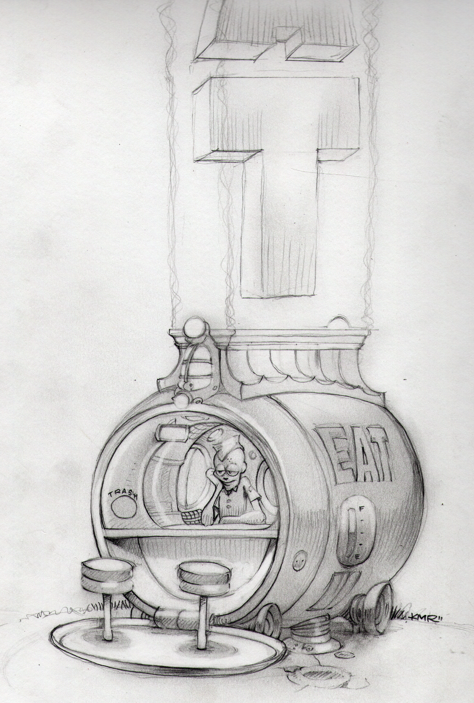
For some reason, the word morsel sounds really cool to me. The verse has little to do with the image, in fact, it has more to do with the previous post. It’s my friend, Lee’s daily contribution. How it relates to this image is complicated. I call it my train-wreck-of-a-thought syndrome. Okay, the train begins with the word “morsel” from Lee’s post. I was thinking about what a morsel would look like, like “What is a morsel?” At this point, the word doesn’t even look like a word, you know what I mean, kind of like vacuum? Anyhoo, then I thought about the Morsel of the future and how it could revolutionize fast food, kind of like the bonless chicken wing. Now, fast forward to the far, far future where morsels are everywhere and everyone is selling them. That’s what you see here.

So, there you have it. Thank you, Lee. You sparked a fun drawing for me to do.

Young Kings go to War

When it comes to business meetings, I have a saying, “It’s better to sit there and look interesting rather than open your mouth and prove everyone wrong.”

I drew this about twenty years ago for a newspaper article for The Times Herald Record. It was on business lunch etiquette. I have a briefcase under my bed with a hundred or so newspaper pages from when I drew Feature article illustrations. I prided myself with having a fast turn-around time. Once, when a photographer exposed his film and ruined the reel, I was called upon to do a complete drawing in less than two hours notice.

Before now, this was my last attempt to become a real-life illustrator. That’s why I posted it. In that twenty year hiatus, I went back to school, became a 3D animator, Art Director, Creative Director, got married, had kids, was laid off twice, bought three houses and two cars. Sadly, I have only a handful of drawings and paintings from that time. I am not one to carry regrets forward, so I will show you the numbers, just for the sake of interest:

20 years of Sketch of the Day equals 7,300 drawings

20 years of Sketch of the Week equals 1040 drawings

20 years of Sketch of the Month equals 240 drawings (This may be closer to the actual number of drawings I created)

Its interesting how the style matches the times. This is a black and white image with no shades of grey. The shading is done entirely with lines.

Vickers Wellington

Okay, this is a good lesson for me as a father. My son asked if I could draw a WWII plane for a buddy of his. He has a book report due and Stevie graciously offered up my services for an illustration. I agreed and set forth to gather intel on the drawing to narrow it down to a specific type of plane. “A plane with a gunner.” he says to me. After we play twenty questions, I finally tell him to send me a photo. He sends a photo of the plane above and texts, “Like this one. With guners and amerecan.” I figured this would be a good grammar lesson, so I text back, “please ask properly”. I get back, “Could you draw an American plane with gunners, please?” Good enough for me.

So, I start to draw the plane that he sent as reference, not realizing it’s an English Vickers Wellington bomber until I get to the insignia under the wing. Big fail. I even asked him to clarify “American”, gah. Just one of the many ways God likes to keep me humble. So, anyway look for an American plane with gunners soon.

I love drawing the drastic contrast between the main bomber and just about everything else. I chose not to motion blur the propeller, instead I opted to keep it very liner and let the lines define the illusion.

Vampire Cupcake

This is a birthday request from a good friend of mine, Lori.

I love sweets. The sweeter, the better. Some of my favorites include Smarties, Sprees, Sweet Tarts, Skittles, Laffy Taffy and circus peanuts. In my mind, the more unnatural the color is, the sweeter and more delicious it tastes. Oh, God how I wish highlighters were edible.

I chose hot pink for the icing because fake-strawberry is my absolute favorite flavor of all time. Plus, it doubles as a brain-looking mass to give it a creepy look. I added the sprinkles because I am fond of them and they give the icing another layer of texture. I kept the teeth small and the mouth closed, so the shape of the cupcake remains intact.

Eye of the Beholder

I believe that if someone put forth the effort to create something, then it’s worth pondering. Art Evokes Emotion. Even if the emotion you feel is considered negative. This may be the artists intention. If you feel something by experiencing that piece, then it worked. It is effective art. What is the opposite of love? Most will say hate, but it’s not, it’s apathy – the lack of emotion. It’s the same with any emotion. That’s what I believe, anyway.

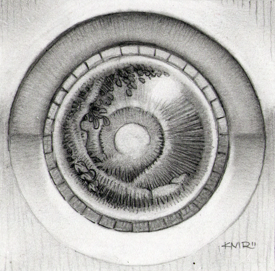
If you can’t tell, this is a RoBot eye. I tried to give it an organic look by tracing over the circles loosely. I kept the foliage inside neatly manicured, so it would blend in well with the iris and not be a distraction. The attempt was to blur the lines between the mechanical and the biological.

Das Boot

I know it has nothing to do with the sketch, but if you haven’t already seen Das Boot, I highly recommend it. Incredible movie about a German U-boat crew, during the period of WWII when they really didn’t have a long life expectancy. The German Luftwaffe pilot had it really bad as well with a ninety nine percent casualty rate at the end of the war. One pilot out of one hundred survived to the end. Geez, would you rather fall thousands of feet, burning all the way to the ground, or crushed to death in the briney depths of the ocean? Where do I sign up?

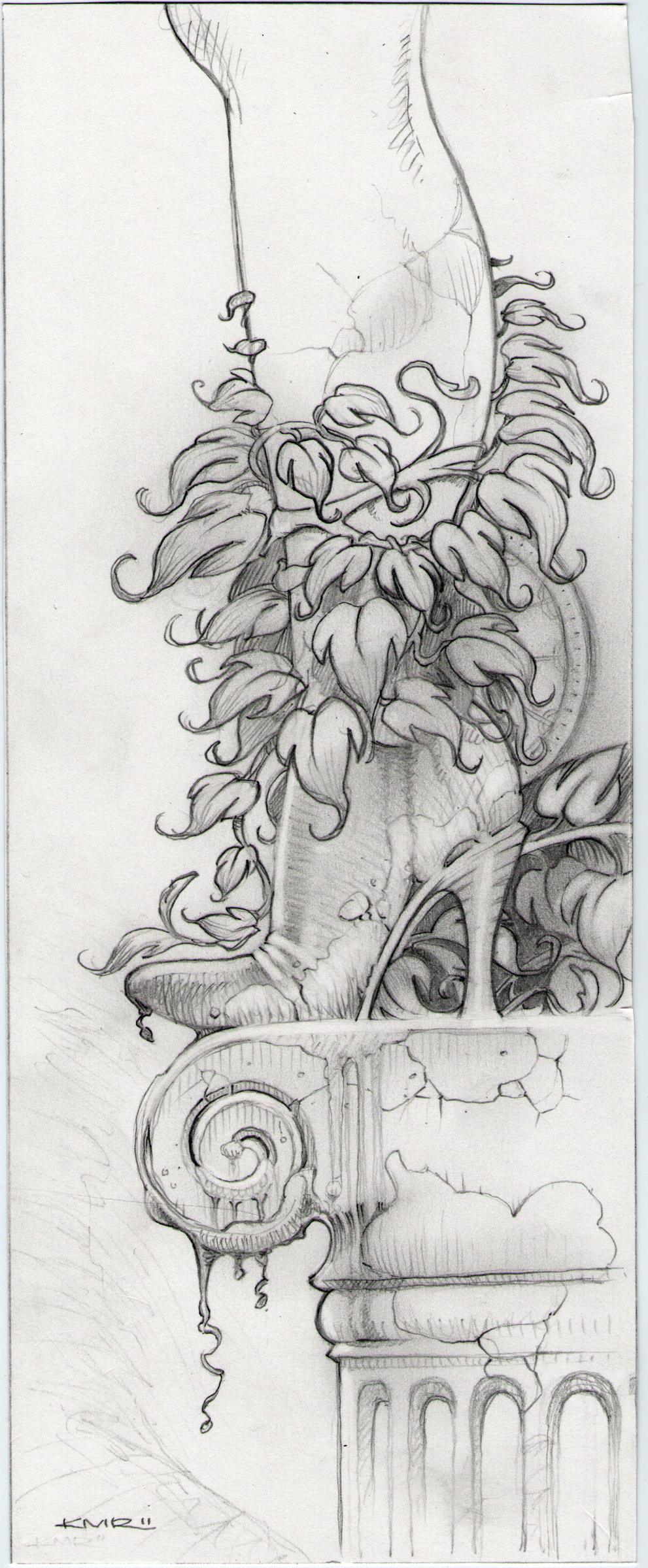
Anyhoo, this is really another study of foliage. I took what I liked from Sir Everworth and expounded a bit. Although, the texture of the column and leg is supposed to be marble, I tried to strike a balance between the individual textures. Specifically, the stacked wood of the heel, the leather of the boot, and the flesh of the leg. I created a unique relationship between the heel and the foliage behind it, by continuing the arc of the sole of the boot with the stalk of the vine and shading the area enclosed. I deliberately kept the heel light to create both depth and contrast.

Sir Everworth of the Lazy Path Shire

“Don’t ask yourself what the world needs. Ask yourself what makes you come alive and then go do that. Because what the world needs is people who have come alive.”

Howard Thurman

I am an artist.

When it comes to career paths, I’ve proven to be a sucker for an impressive title. Especially if it came with my own office and minions to do my bidding. All too often I was quick to betray my personal goals of becoming an Illustrator to work core hours for the betterment of the company. “Hey, I’m lucky to have the job, right?” I fooled myself into believing as long as my title had “art” or “creative” in it, I was more successful than a mere artist and it certainly did pay more.

I am an artist, by the grace of God.

Sir Everworth represents the personal crusade we all wish to persue – that of self discovery. By the position of his hand on the sword, you see he is poised and ready to fight the good fight, however that’s as far as it goes. He represents the noble thought with no action behind it.

The sword and shield are a shade lighter, pulling them to the foreground in this sketch, leaving the rest of our crusader in the middle. I decided to create a storm in the far back, just to balance out the vine growing around his head on the right and to create more depth. This sketch also gave me an opportunity to really explore some foliage options – notice all the different leaves and fungus.