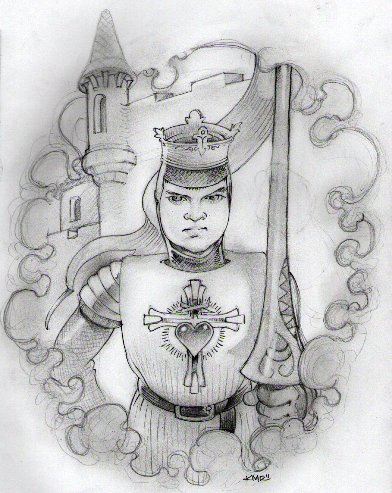
James Mardukas


This is a character I’ve been working on for a couple of weeks. His name is James Mardukas. He is a cross between Hank Mardukas, best friend of the main character’s father in “I Love You, Man” and James Judd, a gentleman I work with. The personality is a culmination of all the neighbors I had growing up on Roberts st. All beer drinkers (Stegmaier), most veterans and all just as cool as the next. There were a mix of Polaks, Slovaks, Italians, and us. I was lucky growing up. The gun in the background is there because I think it looks cool. That’s it.

I started this sketch on a piece of paper I used to rest my hand on while drawing. My son says its the same idea of lines that he learned in first grade. “It’s just straight lines, diagonal lines, and squiggly lines. But, just more complicated”. I agree with him.

 

3rd & 50

Thank God for the return of football. If you think about sport, besides the side bet, there’s no positive or constructive outcome. So, why do we pay athletes millions for the privelidge of watching them do the very thing they love? I think that’s it.

Love.

We love watching the best athletes in the game compete against one another. We love the bragging rights we have for at least one whole year when our team barely pulls out a victory in the last seconds of the game. We love watching the highlight reel from every single game before we turn in at night. We love the underdog. What a great game and thank God it’s back.

I drew this in honor of my good buddy, Mike Lunsford. He’s a huge Tech fan. He’s always running around his house yelling, “Go Jackets!”. Go Tech, Beat Georgia! Don’t worry buddy, I said it for you.

I am really happy with the texture of the grass. All it is is a bunch of random pencil strokes close together. I was going to get a little more detailed with the fans, but decided it would take away from the main focus, in this case it’s the eyes of the robot catching the ball.


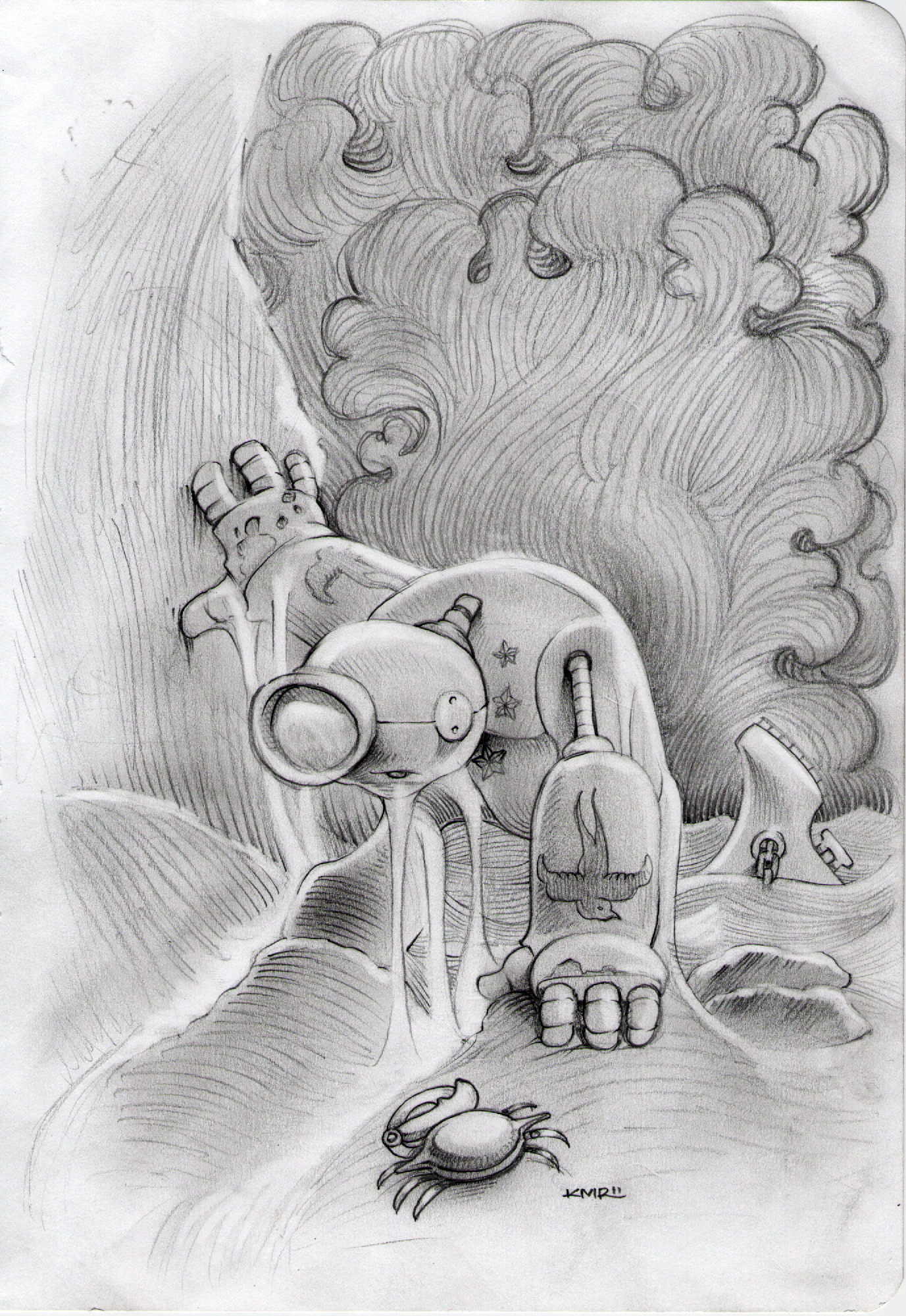
The Storm

This is if Iron Giant met Popeye and they had a love child. No, not really. When I was in college, I hung a post card of a Howard Pyle painting on my wall titled Marooned. It’s one of the few paintings that I could really lose myself in. Pretty ironic, since there’s hardly anything to it. I often pondered, if ole Howard had extended the painting to the right or left another ten inches, would there be shelter or food? Either way, he’s a man that survived the deep waters of the sea, only to be left alone with his thoughts. So, what would you think about? I think the first thing I would do is pray. Ask God why the heck would you save me from the water just to leave me here.

I developed the clouds a bit more to create a stylistic “storm”. I continued to use the contour lines throughout the landscape to make the character pop. I kept the water streaming off of the robot very simple – at the risk of making it look like snot. The reason is, I wanted to carry the style all the way through. If I tried to make real water, I think it may have confused the viewer. By the way, the robot is looking down at the rocks. The round thing on top is a sailors cap.

Here’s looking at you

I both love and dislike horror movies. They scare the crap out of me, but there’s something about the macabre that sparks my interest and keeps me watching, even though I know it’s going to scare the crap out of me. After watching The Sixth Sense, I couldn’t stand at the sink and wash dishes for a week. I still have to get a running start and jump into bed, lest a little girl grab my ankles. Gah, I just creeped myself out. The big hair is inspired by my good friend, Valerie. She had REALLY big hair in the 80’s. Like, if there was a big hair contest, she’d win.

I had a lot of fun with this drawing. I really wanted to capture a smirk (nice way of saying shit-eating grin) on his face. Just like you’d have if you were either at the prom or getting married.

Erik Wolf

Besides having a really cool name, Erik is an author, marketer and creative. You can see his website Zero-g. He’s a really nice guy. I credit him with suggesting I use a sketch for my profile pic. I’m honored that he let me pay him back with a portrait.

Here’s an example of filling in with pencil. I rarely use this technique, just because it’s messy and I find it difficult to keep the paper clean. If I have to use it, I wait until all the detail work is complete and then fill in with the dark part. In this case, I wanted to leave the pencil marks visible for texture. It can always be turned solid in Photoshop.

Senior~ Wenceslaus character study

This is a detail of a larger character study of Senior~ Wenceslaus. After drawing him a couple of times in my sketches, I decided it was time to concentrate on the man so he may have a uniform look. There will be more to follow. I doubt he will look exactly like the current sketches when he’s ready for prime time. I drew him eight times in total and each time, he would evolve a little more. Once I feel comfortable with his look, I will do a more formal study on him.

Missed it by this much

Gah. Off by one letter…I am creating a sign for my first show tonight and I was off by the “r”. Actually, the hat that covered it was an afterthought and became more important than the signage itself. Mistakes happen in drawing. What I mean by mistakes is, when you make a mark on your paper, it did not turn out the way you intended. I see these lines as objects that need imagination to come to life. I can promise you, it was an unintended line that brought that hat to life.

I added color – Holee. Since this was intended to be a rough sketch, I left the letters as loose as I could without compromising the legibility. I have posted the actual sign here. It’s turning out a bit different, just because the initial RoBot didn’t fit. I am going to hang it tonight exactly as you see it now. It’s a work in progress and may change even more later on. I have thoughts of painting over everything in oils.

The Thread Baron

I love to draw scenes, so much, I get lost in them. It doesn’t matter if it’s a cityscape or a landscape, I follow a simple philosophy: Give the viewer somewhere to go and give them something to do when they get there. I got that from my best friend, Larry. He’s a landscaper by trade and a sculptor on the side. This scene is straight out of my imagination. It may be a setting for Senior~ Wenc.

This drawing concentrates on textures and I love the dramatic effect that water reflection has. In this case, it’s more like thick varnish. I like the way the thread and orbs above the door turned out. It’s supposed to look like chrome and I think it does.

Self Portrait II

Every once in a while, I will grow my beard just to shave it in cool ways. I usually chronicle the look by taking pics as I shave. One of these photos made it to my website. It’s on the About Me page. By the way, my whiskers have a lot of grey in them – not so evident here. Artistic license at its best.

I used bristol board for this sketch. It seems to hold up better with all the smudging I do. I have three paper stocks that I use for my drawings. The reason I use three different types is pretty simple, because I have three different sketchbooks. I will draw on pretty much any type of paper. When I was young, my mother would buy reams of notebook paper for me. I would draw on both sides. Anyway, I like the way this sketch turned out. The blending turned out exactly the way I wanted to. Not too heavy and just the right darkness. The erased areas really pop without looking too contrived.

Cyrus the Brave

This is a portrait of a fellow artist, Cyrus. He’s seven and his mother says he would rather draw, paint or sculpt than eat. A young man after my own heart. I remember having that passion when I was his age. I would sit in my room and draw for hours, even in the middle of summer. My mother still tells stories about turning Greggy away at the front door. My advice to any young artist; Never stop creating what makes you happy, because you bring joy to others as well. Just ask your mom or dad. They’ll tell you that’s why God gave us refrigerators.

This drawing started with his eyes and appeared outward from the center. His reference photo was of him looking “mean”, however I interpreted it as a brave face, hence, the title. I drew the cloud pattern as an outline this time. If I took more time, I think I’d experiment with it a bit. Maybe a pattern, or some foliage. But, then again, it may have distracted from the main focus – his eyes.